& Other Stories Unveils a New Chapter Under Jonathan Saunders
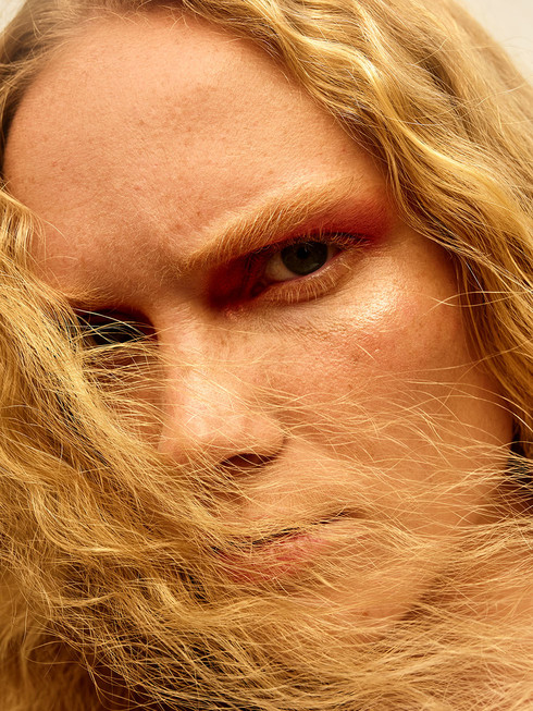
Written by Ulrika Lindqvist& Other Stories steps into a bold new era this fall. Under the creative direction of newly appointed Chief Creative Officer Jonathan Saunders, the brand introduces a refreshed identity marked by a new logo, tone of voice, and a more expressive approach to design and styling. The transformation debuts with the first chapter of the Fall 2025 collection, presented in a campaign photographed by Oliver Hadlee Pearch.
“The Fall campaign celebrates real clothes for everyday experiences, designed to inspire individuality. The new brand identity combines nostalgia with modernity and signifies an exciting new chapter for & Other Stories,” says Saunders.
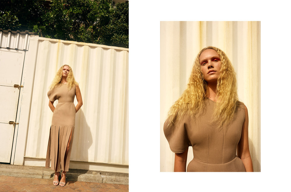
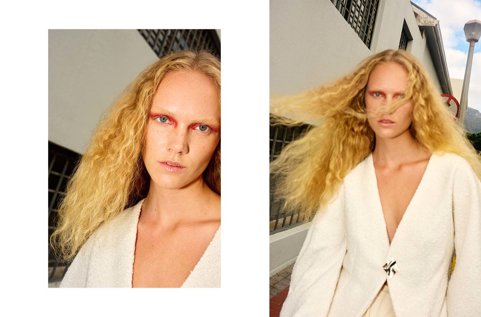
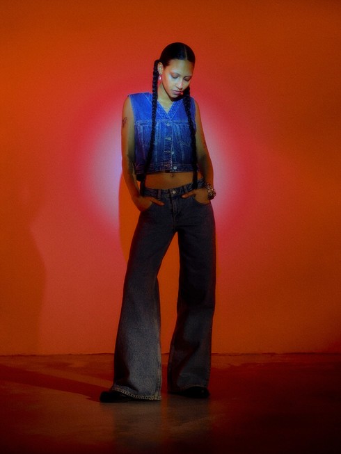
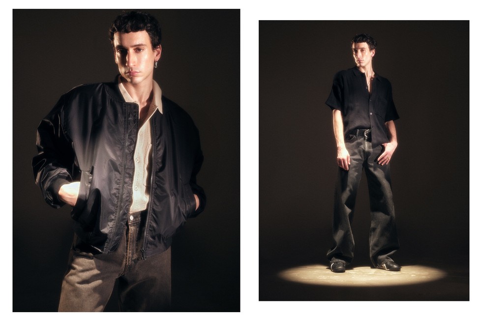
Saunders’s debut collection draws on references from the 60s, 70s, and 90s, reimagining wardrobe staples through progressive silhouettes, lived-in textures, and technical fabrics. There is a sense of ease throughout, with styling that embraces individuality: bomber jackets paired with corduroy trousers, knitwear layered over pencil skirts, tailored miniskirts with revived bow blouses, and oversized wool coats draped over slouchy denim. Playful contrasts define the palette, with vibrant shades of pink, ultramarine blue, and lemon yellow punctuating the season’s more grounded hues of earthy brown, charcoal, burgundy, and black.
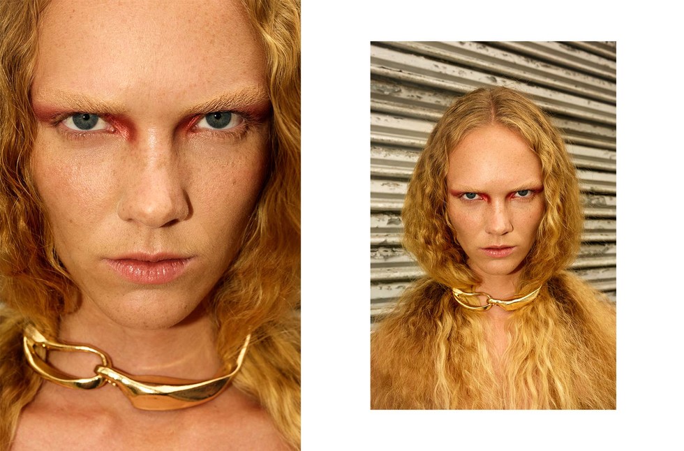
The silhouettes merge sharp cuts with relaxed tailoring, bringing together the elegance of the 60s and 70s with the laid-back spirit of the 90s. Textures heighten this interplay: fuzzy mohair, croc-effect leather, jacquard, and corduroy evoke nostalgia, while Italian wool suiting and technical nylon outerwear add a contemporary edge. Accessories continue the dialogue between past and present, from 70s-inspired sunglasses and bowling-style leather bags to chunky gold necklaces and belts worn cinched over knitwear. Loafers and Chelsea boots nod to Mod heritage, while oversized teddy bags soften more structured looks.
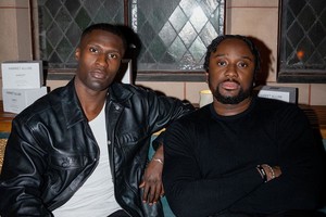
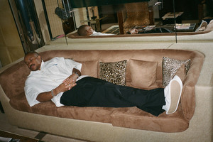
The Fall 2025 campaign introduces models Thea Almqvist, Xaria Carter, and Sihana Shalaj, styled by Isabelle Sayer, with art direction from JL Studio and executive production by Sylvia Farago. Together, they bring to life Saunders’s vision of modern nostalgia, setting the stage for a new chapter in & Other Stories’ evolution.